<<< back home

Sashko Pop-Angelov

> summary


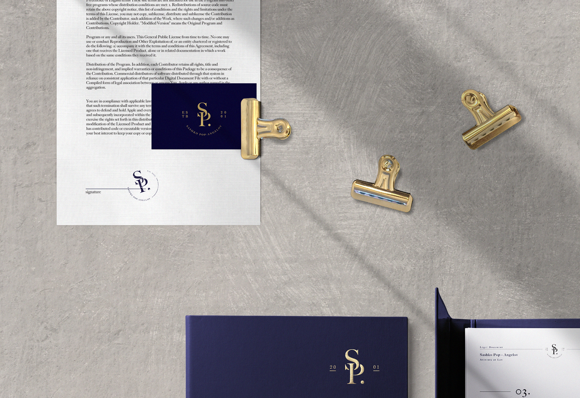
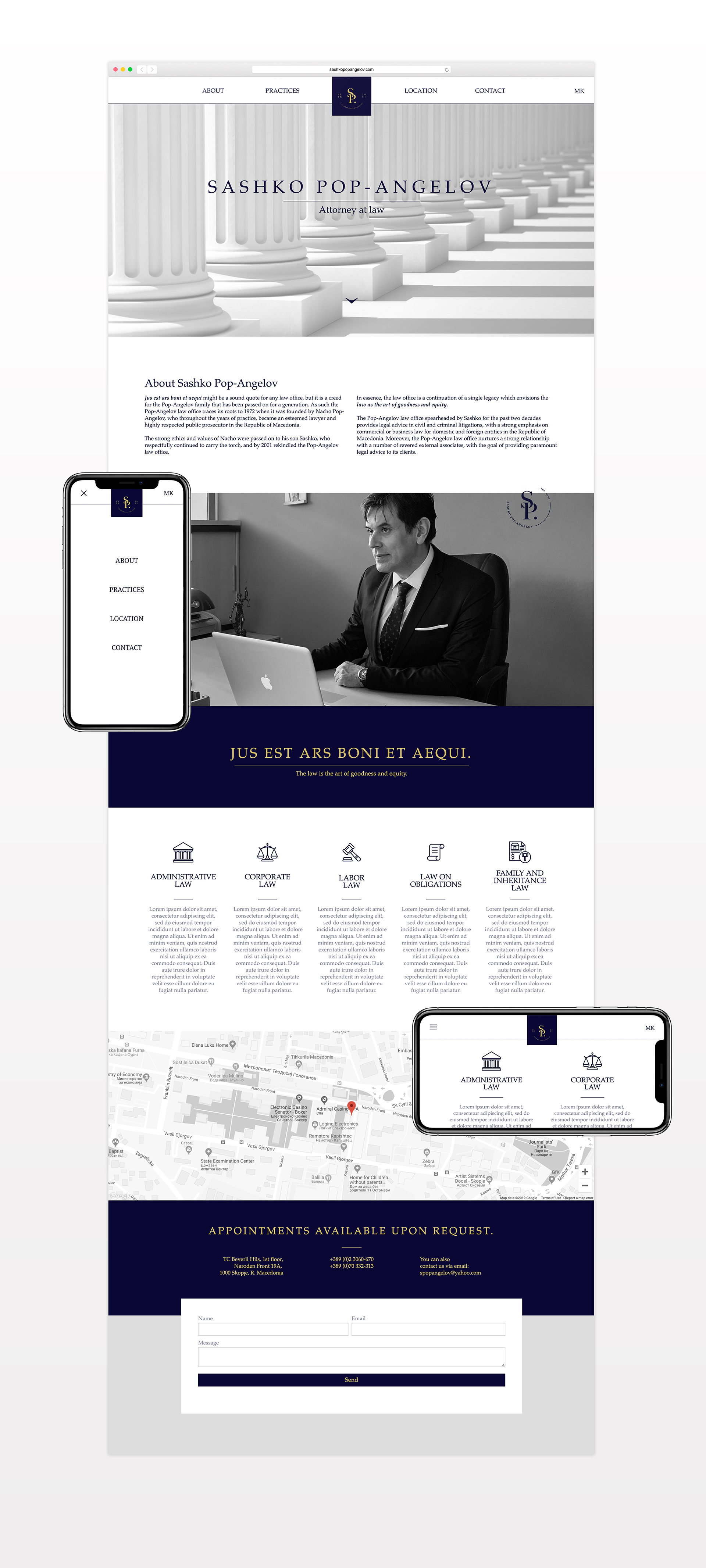
Recently, I had the opportunity to create a core branding & website
for a small law firm called Sashko Pop-Angelov.
The law office was originally founded in 1972 by Sashko's father,
closed in 1998, and reopened again in 2001 by Sashko.
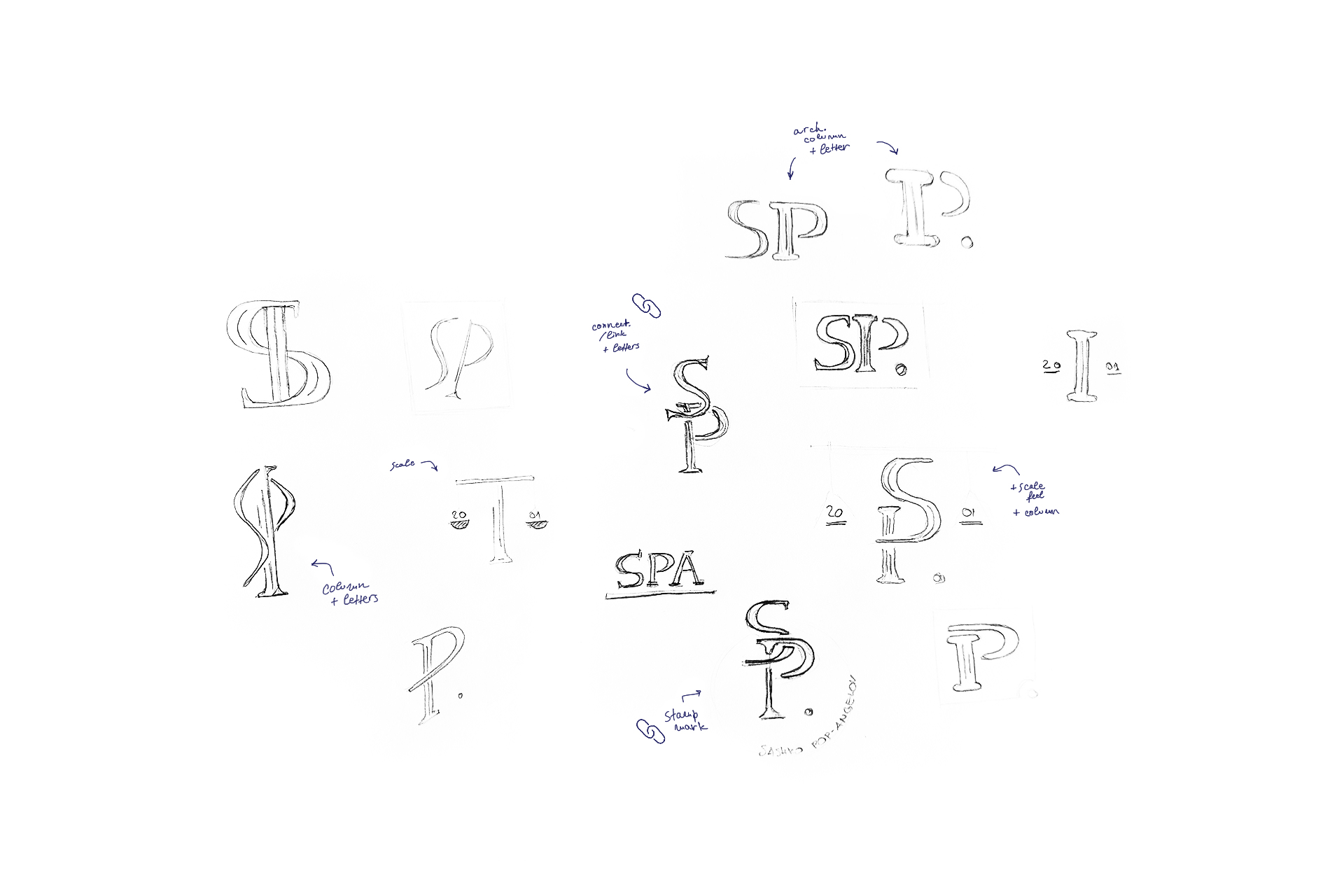
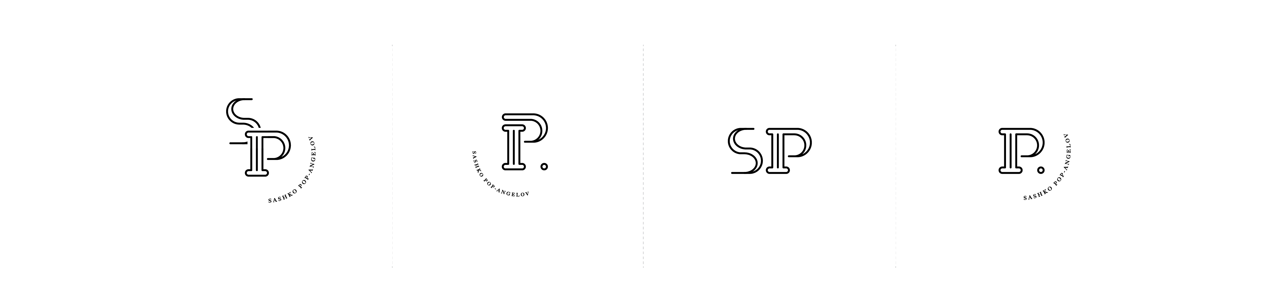
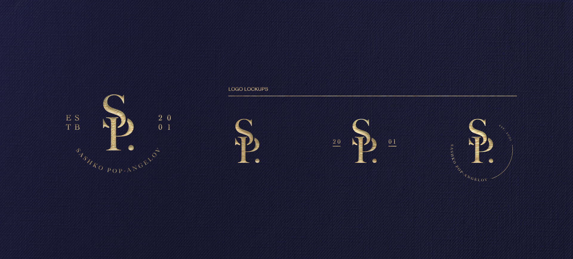
In essence, the law office is a continuation of a single legacy
which envisions the law as art of goodness and equity,
so the visual language needed to represent the strong traditional values.

My Role: Art Direction, Branding, & Website

Year: 2018-2019
Not interested in the Case Study?
VISUALS ONLY

> brand's definition


Jus est ars boni et aequi might be a sound quote for any law office, but it is a creed for the Pop-Angelov family that has been passed on for a generation.

Brand's core values and main characteristics are Legacy, Integrity, Trust & Connection: Connection with the clients & Connection with strong traditional values.

> research


The research is a general overview on global and local law offices,
with focus on their logo's key features, first impressions, used type,
colours and the most common symbols.
GLOBAL

Biggest law firms in the world,
based on yearly revenue.

MAIN FEATURES:
Simplicity, Boldness, Logotype or Combination Mark, Use of 1 Colour

TYPE CLASSIFICATIONS:
Most of them use Sans Serif Font, some use Serif Font

MOST COMMON COLOURS:

Blue, Red, Black

LOGOMARK:
Capital Letters

LOCAL

Client’s direct / indirect commpetition,
based on location & firm size.

MAIN FEATURES:
Complexity, Thickness, Combination Mark, Serif, Use of 1/2 Colours

TYPE CLASSIFICATIONS:
Most of them use Serif Font, some use Sans Serif Font

MOST COMMON COLORS:
Black, Blue, Red, Gold

LOGOMARK:
Scale of Justice, Lady of Justice, Roman Architecture Pillar, Shield, Capital Letters

> concept exploration


After identifying the brand’s definition and logo research, I decided to make a balanced
combination between the results of the global and local logos research.
This decision was made to bring the brand closer to the global and more sophisticated look,
without separating it too much from the local scene.


> key features: Simplicity as the Ultimate Sophistication, Combination Mark,
Use of 1/2 Colours, Serif Font, Blue, Capital Letters, Roman Architecture Pillar.
 

> first concept sketches:
> digitalisation & exploring different lockups: 

1st concept.
The idea behind this concept revolves around the Roman Architecture Pillar as a representation of the Roman Law that the office practices.
The problem: The logo is not serious enough and is lacking the traditional feel.
It provided additional challenge when used as a stamp.
2nd concept.

The main idea behind this concept is to create a feeling of connectivity. Connectivity with both the clients and the family values.

The secondary and hidden symbol in this concept is the Architecture Pillar, as a representation of the Roman Law.
The use of only old type family font to create the shape is helping with the traditional feel and makes the logo more appealing to the brand's core values and characteristics.

Additionally, the logo is working perfectly as a rubber stamp.

> define & develop


After presenting the first concepts to the client I got a green light to continue with the 2nd concept.
In the next phase I concluded the font, colours, shapes and logo lockups.

> font:

I used Big Caslon Medium (for letters) & Cochin (for numbers), serif fonts from the OldType Family.
Serif typefaces are some of the older typefaces.


Because of their age, the mood associated with serif typefaces is often classic, romantic, elegant, formal and established.

> colours:

After defining the brand core values and concluding the results from the research the colour presented itself - dark blue.

Dark blue is associated with depth, expertise, and stability.
It represents knowledge, power, integrity, and seriousness.


To warm up the cold effect of the dark blue I decided to use gold as complimentary and secondary (detail) colour.

The colour gold is a warm colour that can be either bright and cheerful or somber and traditional. It is often associated with illumination, love, compassion, courage, passion, magic, and wisdom.

> shapes:

The logo mark is created only by using capital letters and a dot. Letters are positioned to create a feeling of connectivity and the dot is added for visual balance and represents stability.


In addition, the mark contains a secondary / hidden shape: Architecture Pillar Symbol, created by disrupting the flow of the P-letter and leaving the stem to stand alone.


> implementation  


Logo implementation on different materials and creating a single visual language across both traditional and digital platforms.

> digital presence


A website is the business card of the digital age and not having one is not an option.

This goal was very simple and straightforward. The product needed to answer 3 questions:

1. Who is Sashko?
2. What kind of law does he practice?
3. How can I contact him?

I decided to create a simple landing page website with a main navigation bar and language button at the top,
leading with photo and short about section, quote, practices, location map, and contact info + contact form
at the very bottom of the page.

I built the website in Webflow, but it's not live yet.
If you are interested you can experience a fully functional demo by clicking the button below.
VISIT SITE